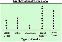
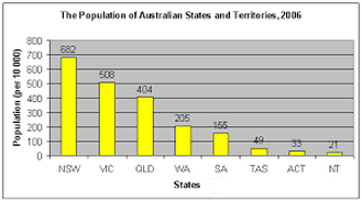
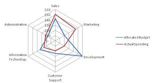
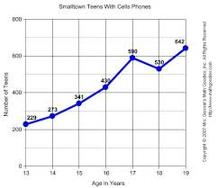
|
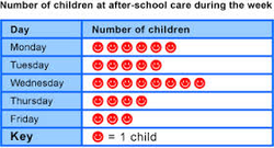
Dot plot= The dot plot as a representation of a distribution consists of group of data points plotted on a simple scale. Dot plots are used for continuous, quantitative, univariate data. Data points may be labelled if there are few of them. Column graph= In the column graph the data is literally presented in columns. The category names can be on the graph or underneath the column. It is not necessary to assign different colours to the columns although one could do so and then attach a legend that would explain the different colours and which category they stood for. Radar chart= A radar chart is a graphical method of displaying multivariate data in the form of a two-dimensional chart of three or more quantitative variables represented on axes starting from the same point. The relative position and angle of the axes is typically uninformative. Line graph= Line graphs can be used to compare changes over the same period of time for more than one group Picture graph= A picture graph is used for massive amounts of data, for example when collecting the population of Australia, NZ and China, one "person" = 1,000,000 people and 1/2 a person = 500,000 people |